6 Squarespace Design Tips To Upgrade Your Website
Ready to upgrade your website? Use these simple Squarespace Design Tips to customize and make your website standout!
The absolute worst feeling about starting your biz is comparison.
Comparing yourself to people who have been doing it for years, or comparing it to people who have invested at least four dollar signs into hiring a design team, copywriter, and more to get their business going. And then there’s comparing my personal gig to my corporate gig-everything needs to be perfect as if I’m a business of 300 people all working to make me a success 🙄.
When really, the core of my business is to make an impact and change lives.
And of course, we want everything to be flawless (come on, I’m human), but some of us don’t have the resources, time or the skills to be polished from the get-go. Instead, I like to stare at websites and allow my inner bitch reconfirm what I already believe.
“You are kidding yourself! Do you actually think you can have a website that looks this good?”
“Like you have the time or money to create something like this!”
“You are never going to make it.”
What a “see-you-next-Tuesday!”

AwkwardFamilyPhotos.com
Now after starting two businesses and making a handful of websites, I see that I did it all wrong. Like more wrong than the hair wave that was oh so popular in the ‘80s.
[eeek, we do not need that coming back any time soon.]
But seriously, I went about building my first business all wrong because of comparison and limiting beliefs.
Top Limiting Beliefs:
the only way I will appear legit is by having headshots
a brand style guide
professional logo
and all the things a blogger says we should have to build a business
But you don’t have to!!! You can start with much less, no premo designed logo or photos needed to bring in dolla dolla bills yall.
And when you MAKE money, you can invest in someone to create your brand exactly how you envisioned it.
Besides, if you were to pay the money upfront to make it look finished, you may find that your business changed from its inception. But because you (I) decided to pay $1k for logos, colors, patterns, fonts, and your (my) business evolved and that it actually doesn’t fit your (my) brand anymore- you (I) feel like you are (I’m) stuck because you (I) spent all of this money. Yep, this is a story about me.
Here’s how you can prevent wasting thousands of dollars, and upgrade your Squarespace website for free plus some paid tips too.
Table of Contents Show
Free Squarespace Design Tips for 7.1
Use high-quality photos (free from sites)


Unsplash is by far my favorite website to get free stock images. High end, high quality and a wide variation of photos for every niche. The key is to use pictures with the same look and within the same color palette. I am not great at being matchy-matchy, but man it does make a huge difference when you are working with HD pics!!
Also, don’t take your business so literal! Just because you work with computers, doesn’t mean every picture has to be a computer. Spice it up! Use pictures of computers, people, notepads, get out there and use landscape pics too!
Need more free quality image sites? Get all the free stock image websites here. (It’s incredible what the fifth website can do with pictures!)
Use Fonts that Exist in Squarespace
Are you a design student, or a creative genius? I didn’t think so, because neither am I! But I do know when fonts tickle my fancy. How do you find fonts for your headers and body that go together without hiring a designer??
Go to Pinterest>Search> “website fonts Squarespace” Keep searching until you find 2-3 font sets that are all the way your vibe. Afterward, test them on your site or try them with your mood board. This is way better than having to do the work yourself.
You could also download the Chrome Extension “WhatFont” and begin to scour websites, but trust me, it takes forever. You will be endlessly searching for not much progress because many sites import their own fonts. Let your future designer do that for you and stick with the fonts that are already in Squarespace.
Use copy that is Clear, Not Clever
Make it easy for your future clients and students. Don’t make them click on twenty different pages before they arrive on your services, tell them straight up what you do and how to buy your course or hire you.
Oh but we’re unique and funny and want our personality to shine through every sentence
BUT it’s not going to help you move the needle and sell. Instead of trying to be cute or smart, be straightforward and clear.
For example, when I started HVB, I named my menu: Guided, Nourished, Aligned, spoiler alert, NO ONE GOT IT!!! It made such a difference, once I changed it and used normal human words like…
Menu and Page names should be clear:
Page Names: About or My Story | Services or Work With Me | Shop | Contact | Blog or Musings | Course(s) | Legal | Resources | FreeYour Call-To-Actions also need to be easy to understand
Buttons: Click Here | Download Your Free (Blank)| Book/Schedule Your Call | Share your Story | Post A Comment | Get Access to the (blank) Now | Sign Up for Weekly (Blank) Tips | Join the Facebook Group | Like the Facebook Page
Upload a Browser Icon / Favicon

The standard Squarespace favicon looks like the pic below. Yawn!! Right? Upload a square PNG file and instantly make your site a destination, instead of a dull traffic light!
must be legible as a 10x10 png
if you use letters, only use one letter
if you use an image, focus in on one small object in the image
do not overcomplicate it!
Free CSS Squarespace 7.1 Design Tips
Learn to Hide Headers & Footers to Create Landing Pages
What I love about Squarespace is that you don’t need to get a third-party tool to create landing pages! You can hide the header and footers with a little CSS to make all types of pages from Email landing Pages, Thank You Pages, Upsell Pages, and more! Get the Code here plus more tips!
Add Social Share Buttons
Unlike 7.0 Squarespace, 7.1 does not have Share Buttons on catalogue pages like blogs, products, and portfolios. This means we can either code them in or use a third party tool. I prefer the latter! Use AddThis, to get blog share buttons for free!
If you need a tutorial, you can get it here!
Create a Customized LinkTree Page
We all need to leave LinkTree and other third-party Link in Bio pages behind! Using the code to hide your Header and Footers, you can create your own Link In Bio' Page In Squarespace. This is amazing because you can customize it and it will bring more traffic to your website!
Add Anchor Links to Jump to Sections
An anchor link basically links to an existing section on your website. This is really important because it saves website visitors time and scrolling. How? Well, if you have a sales page, you don’t want people to get arthritis as they scroll down a long page to the checkout button. Give them what they want and use an Anchor link to get them entering their credit card details fast!
Read this tutorial to show you how to add them to your website.
Add PopUps and Announcement Bars
Market your new offers, freebies and more with the integrated marketing tools
Use Icons to Up Your Game
A lot of websites use icons, graphics, and small images to help clarify their messages or offers. It adds another layer of personality and ease for your future client/student.
FontAwesome is wonderful, check out how you can add them to your Squarespace website here!
icons8.com - Free as long as you give them credit!!
Creative Market - every week Creative Market curates four/five free downloads from fonts to templates and sometimes icons. But you can also find them for as cheap as $5. So worth it! (FYI: this is an affiliate link).

Paid Squarespace 7.1 Design Tricks
Squarespace Blog Sidebar
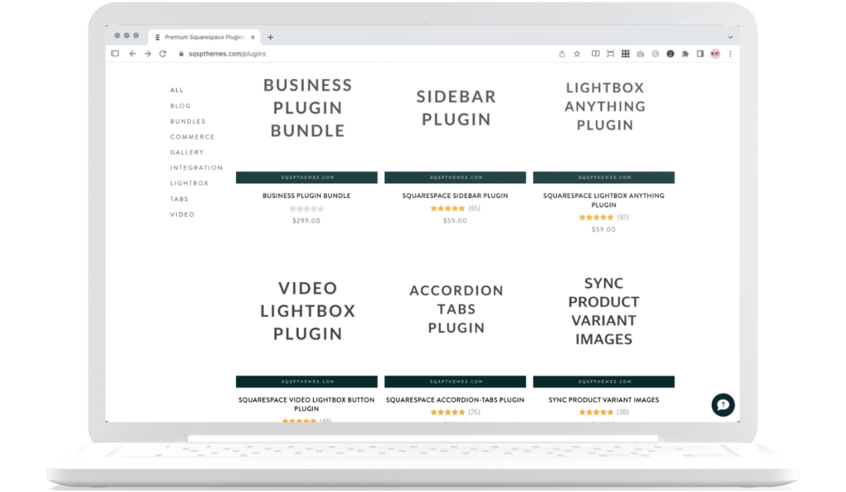
Another feature that Squarespace is lacking is Blog. They say people don’t need them anymore, but I disagree. I get a lot of traction from my Desktop Sidebar that I got from SqspThemes. The Sidebar plugin is super simple to set up, and really drives traffic if you use it correctly! Get it here (aff link).
SqspThemes also has tons of other plugins, you can grab them all here (aff link).
A quick tip when using the Sidebar is to update your blogs using Google Chrome. I use Sidekick (affiliate link) as my browser and it tends to timeout. But I love Sidekick too much to leave.
Squarespace Blog Table of Contents
Okay, I tried making a table of contents on my own, and it’s totally doable, but it does eat up a lot of time. Instead use this awesome Table of Contents plugin. Install it once, customize it however many times you want, and add it to your blog post and the TOC will automatically update on every blog post.
It took some time to add it to my previous blog post, but now I add it to my blog post template and man is it wonderful! Grab it here.
Automatic Disclaimers for Blog Posts
Did you see that affiliate disclaimer box at the beginning of my blog post? Well, unlike the Table of Contents, I didn’t have to embed this on every blog post. Instead, this nifty plugin does all the hard work for you! Add some code in a few places, customize it, and you’re good to go!
Get this awesome Plugin here.
Squarespace 7.1 Templates
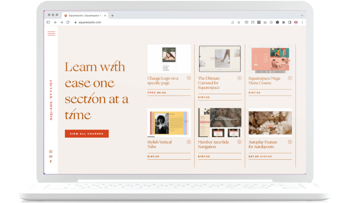
Rachel from Squarestylist has so many great plugins! You can check them out here (aff link), but what I’ve been swooning over is her new Squarespace Template (affiliate link). Gorgeous isn't it?
Purchase a High Quality Images and Mock Ups

I love Moyo’s studio high quality design and aesthetics. Not only can you get 50 free images (aff link), but you can also get a mix of images and scene creators for extremely cheap (aff link). Scene Creators are basically Mock Ups so you can put all of your offers on display.
At the very least, remember to KISS Your Squarespace Design
Yes, KISS, Keep It Simple, Silly. More than anything, keep your design simple, your colors and fonts minimal, and don’t look at other websites because it’s going to keep you in the comparison lane. Right behind the big rig, sandwiched between the teenage driver and the granny car. You will be so stuck and paralyzed you will never see the exit coming!
burrrrrrump burrrump (that’s me making the sound of a big rig horn).
There you have it, SIX tips that will make your website look like a million bucks! Implement these small changes and your website will go from dump to five-star hotel. Plus, you will shut up that inner bitch for good!!
What qualities do you think make a website look profesh? Tell me in the comments below
Check Out These Squarespace Marketing Tips
Are You On Pinterest?
If you enjoyed this post please share it, thanks!